Randrr
A Web App for Job Seekers
My Role
randrr is a career insights platform aimed at early career job seekers and people in career transitions. The UX team at randrr consisted of Ian Latchmansingh, Lead UIX Designer; Jon Bosworth, UX Copy Writer and Content Strategist; and me, UIX Designer. I helped design, test, and develop this app.
Design
The engineering group was not in favor of using traditional requirements documents, particularly because they reduced our agility in our early-stage product. To provide a higher level of visibility and to garner buy-in from leadership around new features, we merged wireframes and user journeys into wireflows. This allowed us to clearly highlight critical actions while also serving as a reference for error and success messages. These were also a litmus test for complexity so that new features could be streamlined into something more digestible for the user.
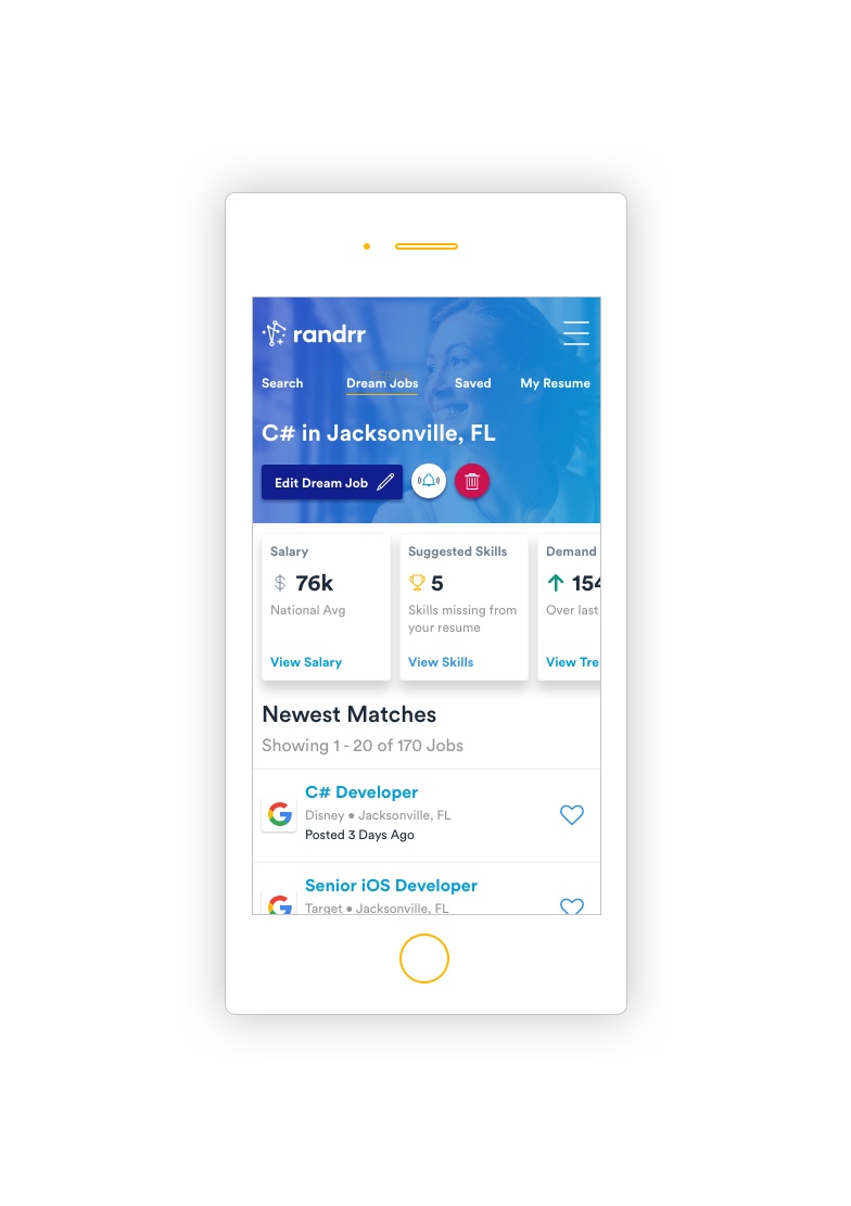
Wireframes, or even loose sketches, quickly become final designs for hand off to the engineering team because of the randrr design system. Our design system is a deceptively simple library thanks to the application of Atomic Design breaking each component down into reusable, fundamental pieces. In practice, our design library management tools allow for all breakpoints of every feature to be updated simultaneously: the system is always the most recent version of the UI.
Additionally, the team and I constructed all components to be fully responsive (when possible) with the exception of a few navigation components and luxuries that are afforded at larger breakpoints. This efficiency made it effortless to construct prototypes for quick usability studies.
While at randrr I took design sprint facilitation training and participated in a number of design sprints to both resolve observed issues and generate new features. One of our early sprints focused on optimization. Our onboarding in alpha was running around 11 minutes, with 50 minutes on the extreme side. We tackled this with a goal of “wowing” the user within 2 minutes. Post-sprint our onboarding was typically between 1m 30s and 2m 30s.
User Testing
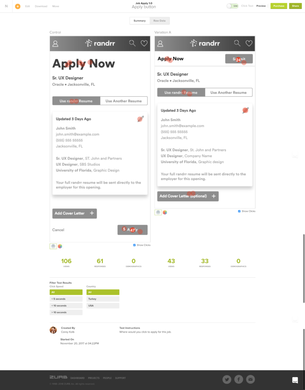
We employed a variety of testing methods that varied from quick hallway tests, guerrilla Starbucks testing, in-person moderated Bring-Your-Own-Device tests, and quick-hit Amazon Turk tests hosted by ZURB’s Notable Platform.
We frequently used Turkers to validate scenarios where we had an internal dispute about language or iconography. It would help us find areas where we can safely deviate from best practices for the sake of innovation. These types of test were conducted almost weekly.
Each iteration or new feature was tested with paid, in-person moderated testers who brought their own devices so they felt comfortable with the scenario. These usually lasted an hour each and typically consisted of 5 to 7 testers. We would take notes live in Lookback.io and share these with the company for the sake of design transparency.
Develop
Given the pressure in a startup environment, there were times where engineering could not deliver fast enough. I would pitch in and help in these situations. I wrote SCSS to ensure the app reflected our designs.